- Description
- When To Use
- How To Interact
- How To Implement
- Why Use This
- Screenshot
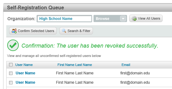
Notification to the user that one of there actions has been completed successfully.
The user needs to be provided with feedback that shows they have made a change.
The user will only be able to view Confirmation Messages.
Message should be bolded in large green text towards the top of the page. A green check mark icon should be placed in front of the message to denote confirmation has occured
A loud and prominent confirmation message will ensure that the user knows when one of their actions has been completed by the Portal system.

- Description
- When To Use
- How To Interact
- How To Implement
- Why Use This
- Screenshot
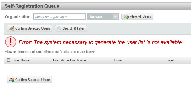
Notification to the user when an error has occured in the Portal system.
The user is unable to generate data from a Portal system.
The user will only be able to view Error Messages.
Message should be bolded in large red text towards the top of the page. A red exclamation icon should be placed in front of the message to denote an error has occured
A loud and prominent error message will ensure that the user knows when an error has occured. This will also help them better identify the source of the problem.

- Description
- When To Use
- How To Interact
- How To Implement
- Why Use This
- Screenshot
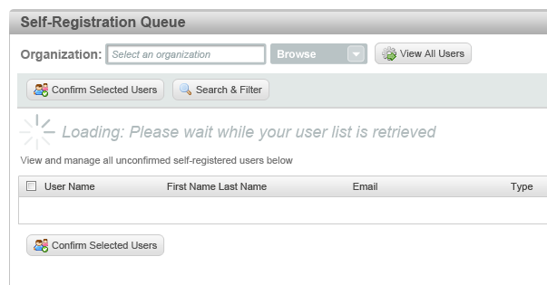
A indicator that appears when the system is loading data.
A page contains a large amount of data and loading times are expected to exceed more than a few seconds for the average connection.
A user only views a pProcessing Message.
An animated spin wheel icon should be used in conjuction with a loading message. The loading message should be placed towards the top of the page so the user can easily view it.
With broadband connections becoming more popular and becoming faster, users have a smaller and smaller threshold for waiting times. Displaying a loading box is necessary in situations where they may become frustrated while waiting.
The loading box addresses two primary goals within these situations. Firstly, the loading screen assures users that their action was successful. If a user clicks an item and does not instantly see a screen change, they may wonder if their action worked and proceed to start clicking again. The loading screen resolves this problem. Secondly, the loading screen occupies the user while the page is loading. Rather than waiting and becoming frustrated, the spinning circle can amuse the user and keep them occupied while the page is loading. This will make the wait time seem as if it is hardly any time at all and will lessen the chances the user may become frustrated due to the waiting times.
