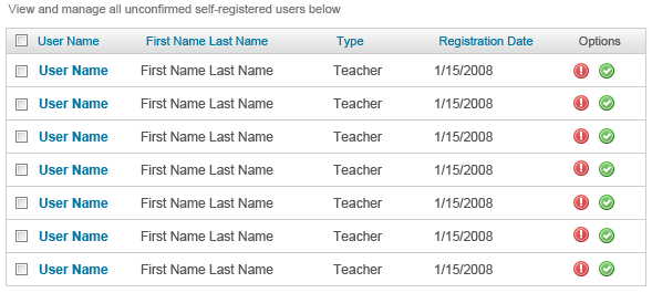
Display Grids are viewed by the user. They can also be sorted when a user clicks the label at the top of a specific column type.
A title should be placed at the top of the grid to describe what is listed below. At the top of the grid should be a header bar filled with the colomn labels a user can sort by. Lines should be used in the grid to seperate each row.

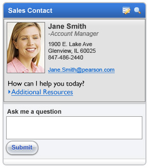
Portlets can be dragged and dropped by the user. The user can also interact with content located within its bounding area. Portlets will also frequently have icons in the upper right corner allowing the user to customize its contents.
Use portlets to organize sets of information together. All portlets should be titled, have their own help function, and possibly the ability to modify settings of the portlet should there exist legitimate settings which a user may want to edit. The portlets have borders so the boundary of where the relevant information exists is clear.
Portlets provide a visually easing way for users to separate information. Through their appearance, it is very clear what data pertains to which sections, and should a user only be interested in one thing, portlets make it easier for the user to find this information. The greater benefit of portlets is the ability to provide users with the power to perform limited actions without refreshing a page. For example, if a user is typing into a search portlet and performs the search, the search results may be updated into the portlet without refreshing any other part of the page. This allows users to save time and not need to be bothered to take the time to learn new interfaces or page designs.
