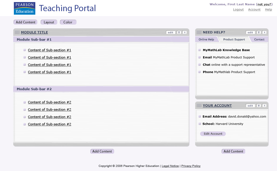
Logo/Portal Text: This is a generic approach to branding and naming that assumes a "Pan-Pearson" approach to the portal. We may decide to create a different brand/name for the Teaching Portal, but this is currently under discussion.
Welcome: This is what a logged in user would see. We'd dynamically replace a user's first and last name from SMS.
Not You?: If a user is using a shared machine and neglects to log off, this link provides a specific way for a subsequent user to log out. This refreshes the portal interface in a logged out state.
Logout: This will log a user out, refreshing the page in the logged out state.
Account: This will link to an account management interface: either (a) SMS Account Summary, or (b) a new account management interface specific to the portal.
Help: This will link to the help documentation for the portal.
Add Content Button: This button will link to an interface that allows a user to add or remove modules. It is undecided precisely how this will be accomplished, but the options being considered are: (a) open a modal secondary browser window, (b) refresh the page, using a hub-and-spoke approach to save or cancel changes, or (c) open a "sliding menu" in the context of the portal interface.
Add Content Button: This button will link to an interface that allows a user to add or remove modules. It is undecided precisely how this will be accomplished, but the options being considered are: (a) open a modal secondary browser window, (b) refresh the page, using a hub-and-spoke approach to save or cancel changes, or (c) open a "sliding menu" in the context of the portal interface.
Add Content Button: This button will link to an interface that allows a user to add or remove modules. It is undecided precisely how this will be accomplished, but the options being considered are: (a) open a modal secondary browser window, (b) refresh the page, using a hub-and-spoke approach to save or cancel changes, or (c) open a "sliding menu" in the context of the portal interface.
Layout Button: This button will link to an interface that allows a user to change the layout structure of the page, e.g. adding or removing "columns."
Color Button: This button will link to an interface that allows a user to change the color scheme of the portal.
Drag-and-drop handle: This section of a module, if clicked and held, will allow a user to drag-and-drop a module to another position on the portal interface.
Drag-and-drop handle: This section of a module, if clicked and held, will allow a user to drag-and-drop a module to another position on the portal interface.
Drag-and-drop handle: This section of a module, if clicked and held, will allow a user to drag-and-drop a module to another position on the portal interface.
Module Title: This link will allow a user to go to an "expanded" interface for one particular module. Most likely this would refresh the page, providing a way back to the main portal interface.
Module Title: This link will allow a user to go to an "expanded" interface for one particular module. Most likely this would refresh the page, providing a way back to the main portal interface.
Module Title: This link will allow a user to go to an "expanded" interface for one particular module. Most likely this would refresh the page, providing a way back to the main portal interface.
Edit Button: This button will open an interface (most likely a layer) that will provide a user with several module controls. These controls may include things such as module settings, remove, move, and so forth.
Expand/Collapse Button: This button will allow a user to minimize or maximize a module without actually removing it from the portal interface.
Remove X Button: This button will allow a user to remove a module from the portal interface. A removed module can be added back using the ‚"Add Content‚" button.
Sub-tab row: This row of "sub-tabs" is an optional element that would allow a user to tab through multiple sections in an individual module. This would only be used as necessary, based on the requirements for a particular module.
Sub-tab row 1: Module sub-bars are one way to sub-divide a module. These would only be used as necessary, based on the requirements for a particular module.
Sub-tab row 2: Module sub-bars are one way to sub-divide a module. These would only be used as necessary, based on the requirements for a particular module.
